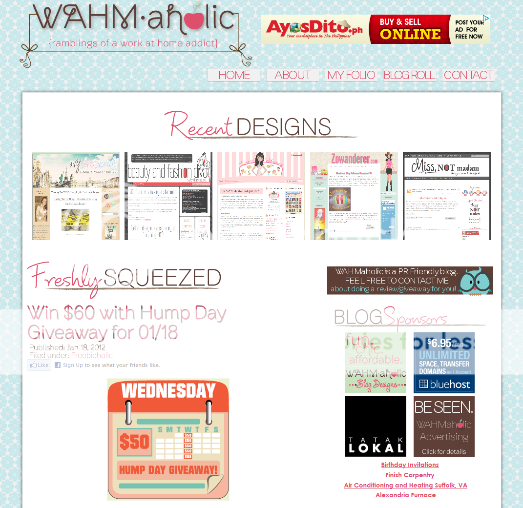
Lying to others is bad, but lying to yourself is unforgivable. In this case, however, I think I can forgive myself for lying that I am not going to redesign this blog look’s anytime soon. Here I am, just three months later, with a semi-new theme to add to my already growing list of “new looks”. Semi-new, because the layout is basically the same (I just removed the three-column footer in the not-so-old design).
I changed my fonts to fun-ner ones, I changed the color combination of the site to my current favorite palette (I honestly can’t seem to like the color blue on a long-term basis), I changed the navigation images AND I added a few extra features missing on my old Headway design (I love my social sharing buttons now! See them at the left side of this article? Sooo nice, if I may say so myself).
The biggest change around here, however, is that this is not Headway-based anymore, but Thesis-based. No, my love story with Headway is not over yet, I just thought it’d be wise to learn how to make WordPress themes using Thesis as well. What better way to start practicing than on my own blog, right? I admit I sorely missed the Live Editor capability of Headway while making this new theme (I had to keep refreshing to see how it looks while I code), but Thesis has a lot of nifty features too that I now adore.
This new look is definitely more “me”, a lot warmer, and it still has my signature clutter. If it isn’t busy then it isn’t me. LOL. I have yet to fully embrace minimalism.
So. What do you think?

22 Responses
Creative and warm to the eyes!!
Congrats with the new look!!!
I love the color combination! I am into Earth colors too.
Ako naman minsan gusto ko minimalist pero minsan gusto ko rin madaming elements. 🙂
OMG I heart! Love it, love it. 😀 Yay for never-ending dissatisfaction with custom themes! 😀
As always, great WP theme pa rin! 🙂
awww…i like this new you, young-looking!! clean ang dating despite of the maarte font which i really, really like. gustuhin ko man gayahin di carry ng powers 😉
I totally understand sis, we’ve lied with this same excuse for so many times lol. My husband knows that too well. 😀 I do wish I can do coding like you do, I love your themes and color combo. love the warm feeling here!
Lie will be forgotten! 😀
i love it, cool color and clean 🙂
I lurve the colors! I think I’m in love with the font, yung red ones. Anong font yan? Parang nice text to include in photos.
ang cute no? hihi. it’s called PF Amateur (the Line Shadow variant)
http://www.fonthaus.com/fonts/Parachute/PF_Amateur/PE10147
Uu, sobra! Ang mahal! $59! Eek, hanggang Google Fonts lang ako, hehehe! Pero super cute niya pa rin!
I LIKE THIS ONE 🙂 kahit naman kasi ano basta ikaw ang gumawa, I LIKE. ehehe yun lang..
it looks more fun and lively! 🙂
I love it! danda… mas okay to!
I like the color scheme and the fonts you used. I think I should redesign my blog too hehe. 😀
Ang ganda nya. ang cool ng colors. ang galing mo talaga
hi ms. kaye! really nice designs, i would love to have you design for my blog. ipon muna :p
I love this new design. It’s cool and clean! Question, how much magparedesign ng blog?
It’s normal for designers to change their blogwear as soon as they feel they’re not contented, happy or just wanna create a new challenge if they can surpass the previous work..
As always sis, each of your designed theme is a work of art 🙂
sis you have a very creative design. You know my blogs has been redesigned till the nth time…until I said myself last week that this is going to be the final design..no more changes. hahaha (I hope!) I am liking your FB page, sis I hope you will like my page back at http://www.facebook.com/pages/Super-Social-W-A-H-M/240725419321945
Please feel free to visit my blogs:
Mom Blog
WHAM Blogger
Sinungaling sinungaling!! LOL!!! ang ganda ng site!! love the special navigators!!! 🙂
Hang ganda ganda! I love colorful designs but I get tired of them easily. This color palette is my kind of style too. Mag-sale ka na Kaye! =)
sa summer siguro ako mag-sale. hehe